GETTING CREATIVE: Context before concept

Like any experienced creative type, I’ve got an unwritten list of rules that I alternately cleave to or break on a daily basis. One that proves surprisingly resilient is “Always understand the context before wasting time on the concept.”
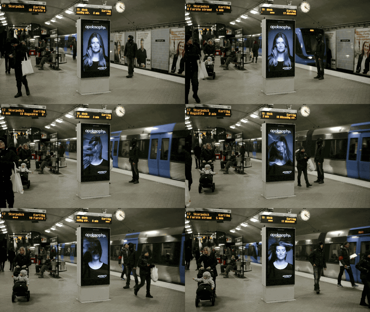
I was reminded of this maxim when I saw the maximum impact this creative concept had for the Swedish drug store chain Apotek Hjärtat back in 2014.
Apotek Hjärtat – Blowing in The Wind from Ourwork on Vimeo.
Still photo on poster comes to life as train enters station.
Result: Gorgeous hair—that requires gorgeous hair products from Apotek Hjärtat.
I bring it up, because that Swedish drug store brand did it again with another contextually relevant, creatively brilliant execution of concept in context.
Apotek Hjärtat – The Coughing Billboard from Ourwork on Vimeo.
Smoker walks by, poster coughs,
and the Apotek Hjärtat brand engages big time.
This is just so smart. The social media buzz about this work has been deafening, and what was certainly not a not-cheap project has returned on its investment in a big way and with legs for days (e.g., digital video clips for social channel sharing, PR hooks for great earned media uptake, mammoth street level discussion about a drug store for crying out loud!).
From my POV, the best part is that until the creatives who worked on these projects talk, there’s no real way to tell which came first, context or concept, because they are perfectly aligned.
Lack of such context / concept alignment is immediately obvious. So much so, it has spawned its own sub-genre of Internet fail. Just Google “ad fails” or some such variant and you’ll be treated to a parade of “what we’re they thinking” badness.
Like this:

Context fail: It’s a delivery van with an A state: door closed and a B state: door open. An understanding of “Context before concept” demands you design for both from the get go.
How about this one for Turkish Airlines:

But for me, here’s the real winner:

And it happened more than once.

This context / concept fail is so epic it’s launched a flotilla of Ad Fail conspiracy theories on Reddit. Did they not know this was going to happen? Could it maybe be on purpose?
Having worked on alcoholic beverage accounts in the past, I cannot believe this was an ambient advertising campaign that passed corporate legal vetting. So it remains a fail, UNLESS :
A. Mike’s Hard Lemonade was really out to market exclusively to vandals
B. Mike’s Hard Lemonade was determined to drive non-vandals away from the brand.
C. It was right before awards season, and some junior creatives were looking for a little book boosting.
None of those possibilities is a good one IMHO.
These bad examples above are no simple, garden variety ad failures showing typos, blatant grammar mistakes or unfortunate media placements. These exhibit context / concept malpractice of the highest (or lowest?) order. When done right (like the Apotek Hjärtat work) and context and concept are perfectly aligned, it’s impossible to tell which came first—and to me, that’s the hallmark of a truly great rule of thumb.
– D.P. Knudten
Chief Collaborator
COLLABORATOR creative
This post as appears in an edited form at InBusiness magazine online